Tuesday, September 27, 2016


Memorial Portraits of Iris

Iris 1950's, (Edition of 50) 2016. Ilmenite and acrylic on paper, 3 x 5 inches
My mother died in April. 

To thank people who came to her memorial, I created an edition of stenciled portraits, drawn from a photo-booth picture of her in her late 20's.  This image suggests revolutionary cafes and poetry slams, and a woman I did not know. She existed before I came - before she brought me - to this earth.  

This is the most glamorous, unknown version of her, in my eyes, showing the spirit within her before she set off for the Caribbean and met my dad. I identify with this earlier adventuress because although the spirit remained, she became, of course, my mother and a more practical person.  
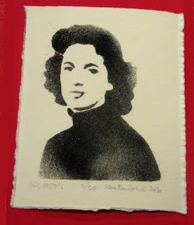
Iris 1950's (2/50), 2016. Ilmenite and acrylic on paper, 3 x 5 inches 


The edition uses powdered iron ore, its blackness fitting the occasion. It looks very like her ashes. The grains separate in places, emphasizing the figure's lack of solidity. 


Sunday, September 25, 2016


Study

Night (with diamond panes), 2016. Acrylic on paper 
Night's fascinating.  Darkness simplifies relationships but can create complex images.

Friday, September 2, 2016


Looking back.

Reflection: interior with lamp, 2015. Gouache on paper. 4 x 5 inches.

Last year I started to make small studies from a series of photos, while Mum watched movies. Studio time was at a premium when she was with us, but these times let me get grounded. The space to experiment with small works like this was amazingly nourishing.

Sunday, August 28, 2016

Night 

 Night 8.26.16, spray paint on velvet, 11.5 x 13 inches

This scrap of fabric feels like it could have functioned like a political talisman, rolled up in a saddlebag as revolutionaries galloped through the night.  

Sunday, August 21, 2016

From light to dark... 

Birds: shadows and reflections (sun, wood paneling, taxidermy case with stuffed quail, and incidental bird ornament), 2015. Digital image. 
We've a glass case containing stuffed quail that was given to Craig's dad (he loved hunting). I found a small ceramic bird ornament in my mum's belongings and put it on the taxidermy case. I liked the visual pun. The late sun comes in to the room and creates all sorts of shadows and reflections on the wood paneling. More puns. 


Saturday, July 16, 2016

A new painting... 16 x 16 inches. Acrylic on birch ply.
A product of process and intervention.
 

Monday, July 11, 2016


Commission complete.


   Blue Tower I, II & III (triptych), 2016.  Acrylic on birch ply, 30 x 35 inches each.

Earlier this year I finished a commission of paintings for the boardrooms of Shumaker, Loop & Kendrick, LLP in Charlotte, NC. This firm has many artists' work in their offices around the USA.  

The law firm was moving to new premises in the Bank of America Plaza skyscraper - an impressively shiny tower.  The location is ultra modern, and their offices are on the 22nd and 23rd floors with full height glass walls on the outside. Awesome views.... standing that high above the city with only glass between me and the drop blew me away. 

Tower (reflection), 2016. Acrylic on birch ply,  40 x 70 inches.


The building with its shiny glass as boundary between office and city intrigued me.  My work plays with flatness and space - i.e. shadows are flat silhouettes representing spatial situations, and mirrors are seemingly impenetrable surfaces but reflect infinite depths. Previous paintings and photographs have focused on curtains and views through windows (of homes, trains or cars). 

Tower (night), 2016. Acrylic on birch ply, 30 x 60 inches.

The geometric structure gives form to the monumental power of commerce, but the way it is treated can take it in a number of directions.  It would be easy to show the brutal, fascist side of skyscrapers (like Hugh Ferriss), or zero in on their faceless anonymity, but my reaction is different.

The seemingly impervious and faceless buildings also house people who make choices each day.  The huge windows must make the outside environment more visible than many other offices do, and the occupants could be encouraged to notice clouds, and the different qualities of light during their daily round. Perhaps by capturing some of the fleeting and intangible beauty of this miraculous world, I could remind them how precious it is.

Construction (vertical columns), 2016. Acrylic on birch ply, 38 x 60 inches.

I created the initial proposal for all the paintings in Photoshop, translating my early sketches and ideas into images that conveyed the concepts, and which looked finished enough to make meaningful decisions about.  


Construction (layers), 2016. Acrylic on birch ply, 39 x 50 inches.

To mix things up a bit, these vertical pieces are riffs on using value and color to construct the illusion of flatness and depth.  Each boardroom was named after a city where the firm has other offices. This last painting in brilliant blues, purples and yellows, was inspired by the Tampa boardroom. 

Sunday, April 21, 2013

Deskilled drawing using gravity

Here I'm using stenciling to create traditional-looking representational drawings that are actually arrived at very differently.  The images look as if they could have been drawn using pencil or charcoal, but are created by the objects as they deflect iron ore particles. 
Heather Lewis, Folded Lace, 2013, (detail)
granular ilmenite, acrylic medium, paper, 17.75 x 15 inches


This is nearer to industrial stenciling processes than the overhead projector drawing, in that it does not involve any hands on adjustments... but it doesn't mean that no skill is involved.  For example Balinese craftsmen deskill the creation of repeat patterns in batik fabric by using preformed stamps, but this is in itself quite a skilled operation. Their process is part of the evolution of unique images into the mass production of fabric lengths. (Note, I'm not interested in replicating images - we already have that in the bag. I'm interested in exploring what non-traditional approaches have to offer drawing itself.) 

Traditional drawings usually need to be "wrestled" into completion. They progress by being continually observed, evaluated and adjusted. Re position certain lines and sections. Make it darker here, add detail there, remove that section completely because it is redundant etc. So, I also had to evaluate the results of my gravity stenciling. Like proofing an artist print I guess. 


Heather Lewis, Brush, granular ilmenite, acrylic medium, paper, 9 x 7.25 inches


In the first few stenciled drawings of each item (not shown here), the image was found to be lacking - it was too pale, not enough contrast and therefore definition of the object. Or it was not composed satisfyingly, etc. As the stenciled drawing is a "one shot" affair, each time I adjusted the process itself I created a new drawing until it met my criteria of worthiness. One difference to the traditional drawing evolution is that the layout of the stenciled drawing is always "correct" - it is directly derived from the object and cannot be otherwise. 

So, the deskilled stenciling process is effective as a means to collect information, and, directed by very traditional decisions, produces what could be seen as a drawing in traditional terms.  

Deskilled drawings - with projections.

To continue exploring stenciling as a process within traditional drawing, I am using an overhead projector to form the original image. 

I discover that this method helps with the layout but does not take skill out the drawing process! It is difficult to draw from a projected image and observation skills still apply as much as they would in any traditional drawing. 

I experiment to find objects that are more than silhouettes. Clear plastic and glass work really well on the overhead as seen below - this is a projection only. No drawing as yet.

 The arches paper roll is 42 inches wide. The image looks great as a projection, so...off I go.
Roughing in was the easy part!  Now with the image generally in place, things get interesting... 

The image below shows projection and drawing occurring at once. As you can imagine, its hard to see what is projected and what is actually drawn. Its essential to evaluate them separately so I use a piece of blank paper to shield the drawing or to reveal the projection by turns.  

I also make many trips back to the projector to switch it off and on, to compare. You really have to scrutinize the drawing to give it the same values and nuances as the projection.

A drawing  is simply a collection of information that echoes optical reality. Put the right combination of light and dark in the right places, in the right shapes, and the illusion "magically" appears. Its a question of getting the exact relationship between these elements.  
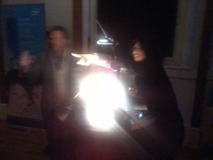


Eventually I even projected the image onto the wall next to the paper (this is not shown) and checked it that way too.  Add, erase, adjust. Repeat... 


Finally...its as close as I can get to the original. 

Sunday, March 25, 2012

Study for installation


Study for "Small chair (large shadow)"


Responding to Vincent's painting of his bedroom. In my work the harsh light from a bare bulb near the floor forms a shadow image that is much larger than the chair itself. I will be recreating the huge shadow in paint, which allows the effect to remain visible after the light has been switched off. These elements can be seen as metaphors for Vincent's unorthodox vision, his struggles in life, and the creation of work that has had such an impact after his death.

Why a shadow? I say a shadow can be seen as a drawing according to traditional criteria in that it translates a 3D situation into 2D format, using edges, value, and perspective.

The chair I have used is Asheville craftsman Brian Boggs' first chair - hand made almost 30 years ago at the start of his career. Though not as close in design to Vincent's rustic chairs as some commercially available styles, it feels closer in spirit. The chair has been generously loaned by the Boggs Collective.

Saturday, November 12, 2011

More Mylar


Five piece set includes,
2011
Mylar
10.25 x 5 inches

This is directed by an image in a swimwear catalog, which I have traced over with a knife. I see this as extracting elements of drawing from the printed color image. I have bought some of these bikinis online and am very happy with them so the catalog works as a sales tool but I find the images unsettling. The combination of beautiful specifics and implied narrative keeps me in a closed loop so I chose to alter this by dismantling the image’s luscious but unsatisfying qualities. I wanted to extract something less lurid that would be less specific, giving me an exit from the frozen cool of a fictitious life. So I selected elements I wanted to look at from the "realism" of the photograph and transferred these to another situation by tracing a contour drawing. The result is recorded as the cut edges of excised shapes, and presented as a shadow on a second layer of Mylar.

A simpler, neutral image feels more congruent with the reality of volume printing, the relentlessness anonymity of hundreds of thousands of copies of this girl. Without the details of the scene and the girl herself, I am less likely to imagine myself splashing playfully in her place. Without the details and product descriptions "matching slouch tote with logo lining...", "hipster with side cinch..." it is impossible to think about buying anything. I don't identify with the shadowy, ghost girl. I can never be her. Instead, the stereotype is made obvious at the same time as THIS particular image has become singular. There is now a way out of the picture, for me. I can move beyond a specific narrative to contemplate broader issues. ...What about the stereotype it presents? What messages are embedded in its structure?

So I've taken action, I've imposed my will in a different way than the marketers intended. I think it has enabled me to see something more clearly. Is it revenge, a sense of outrage that drives me to overturn this "innocent" image? To rip this small drip-feed of consumer medication from my vein? We live and breathe within the calculated structures of 21st Century life so is it a futile gesture? Yes and no. The image is now the subject of a drawing.

A topic for another day.

Tuesday, September 27, 2011

Deskilled Drawing


Just installed a small exhibition at the fabulous Visual Arts Center of New Jersey in Summit, NJ.

Curator Mary Birmingham and Exhibitions Manager Katie Murdock along with the staff at the center went out of their way to help and support the installation process.

Studio X gallery now holds my show "Heather Lewis, deskilled drawing" which runs October 7 - December 11, with an opening reception October 14.


The mural is a painted shadow -
echoing an interactive installation in the gallery itself.


Objects from a kitchen drawer (interactive model), 2011


As the stairwell is flooded with daylight normally, I had to test the idea out at night. Before painting the mural I took some photos of the original projection, getting a fresh sense of it from a distance, and as it was reflected in the large glass windows.

It took quite a while to get the right objects positioned in the image... I wanted the items AND the distortion to make sense. It worked best with some objects running the whole length from small to crazily enlarged. I ended up wearing my sunglasses while working at the projector tray...!


In the hallway below I have framed drawings made with brake grindings, and drawings of folded industrial mesh and sacking using oil paint.

Wednesday, June 8, 2011

Light installation

Photos from the McColl Center for Visual Art, Charlotte, NC
Pay per view, 2011 (no money in meter)
Coin meter, light, mirror tiles
Approximately 4 x 11 x 6 feet


Pay per view, 2011 (money in meter)
Coin meter, light, mirror tiles
Approximately 9 x 11 x 6 feet

detail

Friday, May 6, 2011

new work


Catalog (upholstered armchair), 2011. 2/3 (detail)
Mylar
16 x 15 inches


New work on show at the McColl Center for Visual Art in Charlotte includes a series called "Catalog" which is a 10 foot x 42 inch Mylar hanging with 17 smaller mylar "drawings" of chairs taped to it. I am creating each of the small drawings in editions, and these two are now framed in my studio.


Catalog (stacking chair), 2011. 3/10
Mylar
6 x 5 inches

These drawings are stencils created by tracing (cutting) selected visual information found in a promotional image of the chair - a magazine or sales material.

The cuts show up nicely alone, but when they are behind another sheet of Mylar they have a 3D effect. The images change as the light changes. You'd hang these like stained glass, so that light would be behind them.


Friday, April 22, 2011

It was happening at Hatchfest

April 15th I was in Charlotte opening the McColl Art Center show, and Carlton took this installation to the YMI Hatch party - where it was really popular. It was meant to be writ large in Pack Place Park with 2 projectors, a coin-meter and other niceties, but was rained off.

This installation is called "Found objects" and is an interactive spin-off of a previous work called "Objects from a kitchen drawer" 2009/2011, now on show in Charlotte and pictured on my main website.


So, a success! Carlton says people were taking bits off their phone, taking their high heels off, rolling up bits of tissue to make lettering... and really expressing themselves by creating their own images. Very rewarding - wish I could have been there!

Little disappointed that the installation isn't credited anywhere but with all that was going on that night - that week! - it is amazing that it happened at all. At least we tried it out and discovered it was a big hit.

Carlton, who set up the projector in the YMI was working on a client's computer way out in the sticks til about 7 pm, and had to get back to Asheville to grab what he could for the show. He did a great job - the above photos are some of his, he took them with his phone until the battery ran out. That's what I call dedication!

Photos of the Hatch YMI event overall (including this installation) can also be bought at photographer Camilla Calnan's site here....

And this photo below appeared in the Mountain Xpress this week, taken by Timothy Meinch.

Looks like we'll have to do it again!

More on Charlotte solo show when I get photos. No time for those at the opening reception for that, needless to say...

Sunday, March 13, 2011

Hatchfest

Hatchfest hits Asheville in April, these are mock ups of my intended contribution.


Pay-per-view, 2008/2011, (as imagined on the Pack Tavern building).
coin-operated light installation (interactive prototype).
Dimensions variable
.


Pay-per-view is not a new idea in itself, but in this case it operates a bit differently in three areas.
  • One person will pay for and instigate a few minutes of projection time, for communal rather than purely personal benefit.
  • Each purchase of 4 minutes allows the consumer to contribute to the experience by choosing and arranging objects within their own projected image. Consumption does not need to be passive.
  • And the resulting artwork could be seen as a series of contemporary fine art products conceived and designed by an artist... but produced cheaply in the public sphere by a hired operator and some of the consumers themselves. Facilitated by generated power, just as a factory would be.
I won't be there (my exhibition opens at the McColl in Charlotte that night by odd coincidence) which fits in with the concept. Industrial ideology assumes "unskilled" workers will make the product according to instructions and pre-determined procedure.


This is a rough suggestion of what the end of the park will look like with my own installation on the Pack Tavern (right) and Gene Felice's laser tagging and interactive display on the City Council building (left). ( Note : This may not be at all what Gene's piece looks like, I just roughed it out quickly from remembered Graffiti Research Lab Youtube clips). It shows the general idea of scale at least. Also on show (not visible here) will be a screening of Juried entries to the photography competition, as well as a troupe of fire eaters and a local band.

The city committee apparently was reluctant to include any mention of the word tagging when approving Gene's piece ... so it was changed to laser "writing" - this keeps the taggers happy but obviously is not yet part of the committee's graffiti vocabulary.

Still to test locations and equipment to work out any issues before the night itself. Power will be courtesy of the City of Asheville and/or the mobile Art Lab vehicle with generator operated by the city's Parks, Recreation & Cultural Arts Department.


Downtown Asheville - shown here with imaginary projections on the Asheville Art Museum, and the Legal building. Interesting for another time maybe... Hatch looks like being more lively at the other end of Pack Place.

Saturday, December 11, 2010

Publication coming out

The fall has been very busy with other things but contains some interesting milestones. My work will be included in an upcoming book called "Hyperdrawing : Beyond the lines of contemporary art" edited by Phil Sawdon, Russell Marshall, and others at Loughborough University in the UK. The new book will look at aspects of drawing that go beyond current expectations of what drawing can be. Their first book, "Between the lines of contemporary art" focused on ways contemporary artists use relatively traditional materials associated with drawing and included work from 43 artists including Cornelia Parker, Tracey Emin and David Shrigley.

Meantime also, I'll have something published in TRACEY which is an online, peer reviewed journal at Loughborough University, run by a host of interesting academics including Sawdon and Marshall. I have been a fan of TRACEY for some time, and submitted an article in response to an open call on the topic of art and technology. After a radical rewrite - peer reviews are very useful - digging in to the meat of what I wanted to say, I managed to really clarify ideas that have been trying to come together over the last couple of years. I think it will be very fruitful for future work.

Here's a link to TRACEY
and a link to my article specifically here

Thursday, June 24, 2010

Recent activity


I have fixed up with a venue to show in Artprize 2010 in Michigan this September. These images show little rough mock ups as I start to turn my proposal into reality, and the curator starts to plan the layout.

Proposal in brief is : to display an artwork in 2 parts showing shadows of furniture items from Grand Rapids (known for this industry) next to wall paintings derived from shadows of furniture.

The premise is that a shadow is insubstantial but actually created by a real object in the present. Painted images are more permanent but already record a moment in the past. Like shadows, the furniture products can be understood as concepts (figures on the quarterly index of manufacturing, numbers in a catalog etc) as well as real objects. It seems appropriate that these ideas become visibly part of the city's fabric during the festival.

I had originally thought for this to be outside at night and 50 feet long but it is inside and may be smaller. That's good, it can take many forms. Now it can be seen during the day and I've not sorted out weatherproofing of exterior light sources yet, so that may be something for later and more funding. I'm happy as the curator from the local art college is very contemporary, and the venue has a strong conceptual basis for the show.

Its great - the exercise of applying for this show produced a new idea for a site-specific installation, and the opportunity to bring it to life.

Sunday, May 16, 2010

Light and shade


Teaching classes has occupied most of my spring. In between all that I went to Atlanta to take part in OBSCURA at Eyedrum, with a projection onto their gallery facade. Here I am doing experiments for that in the back yard... how dark does it have to be for a projection to show up?


It worked out. Projection on Eyedrum facade, March 2010.