Tuesday, September 27, 2016


Memorial Portraits of Iris

Iris 1950's, (Edition of 50) 2016. Ilmenite and acrylic on paper, 3 x 5 inches
My mother died in April. 

To thank people who came to her memorial, I created an edition of stenciled portraits, drawn from a photo-booth picture of her in her late 20's.  This image suggests revolutionary cafes and poetry slams, and a woman I did not know. She existed before I came - before she brought me - to this earth.  

This is the most glamorous, unknown version of her, in my eyes, showing the spirit within her before she set off for the Caribbean and met my dad. I identify with this earlier adventuress because although the spirit remained, she became, of course, my mother and a more practical person.  
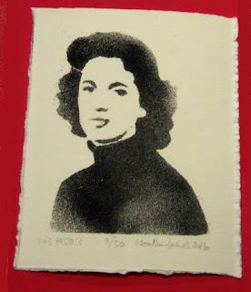
Iris 1950's (2/50), 2016. Ilmenite and acrylic on paper, 3 x 5 inches 


The edition uses powdered iron ore, its blackness fitting the occasion. It looks very like her ashes. The grains separate in places, emphasizing the figure's lack of solidity. 


Sunday, September 25, 2016


Study

Night (with diamond panes), 2016. Acrylic on paper 
Night's fascinating.  Darkness simplifies relationships but can create complex images.

Friday, September 2, 2016


Looking back.

Reflection: interior with lamp, 2015. Gouache on paper. 4 x 5 inches.

Last year I started to make small studies from a series of photos, while Mum watched movies. Studio time was at a premium when she was with us, but these times let me get grounded. The space to experiment with small works like this was amazingly nourishing.

Sunday, August 28, 2016

Night 

 Night 8.26.16, spray paint on velvet, 11.5 x 13 inches

This scrap of fabric feels like it could have functioned like a political talisman, rolled up in a saddlebag as revolutionaries galloped through the night.  

Sunday, August 21, 2016

From light to dark... 

Birds: shadows and reflections (sun, wood paneling, taxidermy case with stuffed quail, and incidental bird ornament), 2015. Digital image. 
We've a glass case containing stuffed quail that was given to Craig's dad (he loved hunting). I found a small ceramic bird ornament in my mum's belongings and put it on the taxidermy case. I liked the visual pun. The late sun comes in to the room and creates all sorts of shadows and reflections on the wood paneling. More puns. 


Saturday, July 16, 2016

A new painting... 16 x 16 inches. Acrylic on birch ply.
A product of process and intervention.
 

Monday, July 11, 2016


Commission complete.


   Blue Tower I, II & III (triptych), 2016.  Acrylic on birch ply, 30 x 35 inches each.

Earlier this year I finished a commission of paintings for the boardrooms of Shumaker, Loop & Kendrick, LLP in Charlotte, NC. This firm has many artists' work in their offices around the USA.  

The law firm was moving to new premises in the Bank of America Plaza skyscraper - an impressively shiny tower.  The location is ultra modern, and their offices are on the 22nd and 23rd floors with full height glass walls on the outside. Awesome views.... standing that high above the city with only glass between me and the drop blew me away. 

Tower (reflection), 2016. Acrylic on birch ply,  40 x 70 inches.


The building with its shiny glass as boundary between office and city intrigued me.  My work plays with flatness and space - i.e. shadows are flat silhouettes representing spatial situations, and mirrors are seemingly impenetrable surfaces but reflect infinite depths. Previous paintings and photographs have focused on curtains and views through windows (of homes, trains or cars). 

Tower (night), 2016. Acrylic on birch ply, 30 x 60 inches.

The geometric structure gives form to the monumental power of commerce, but the way it is treated can take it in a number of directions.  It would be easy to show the brutal, fascist side of skyscrapers (like Hugh Ferriss), or zero in on their faceless anonymity, but my reaction is different.

The seemingly impervious and faceless buildings also house people who make choices each day.  The huge windows must make the outside environment more visible than many other offices do, and the occupants could be encouraged to notice clouds, and the different qualities of light during their daily round. Perhaps by capturing some of the fleeting and intangible beauty of this miraculous world, I could remind them how precious it is.

Construction (vertical columns), 2016. Acrylic on birch ply, 38 x 60 inches.

I created the initial proposal for all the paintings in Photoshop, translating my early sketches and ideas into images that conveyed the concepts, and which looked finished enough to make meaningful decisions about.  


Construction (layers), 2016. Acrylic on birch ply, 39 x 50 inches.

To mix things up a bit, these vertical pieces are riffs on using value and color to construct the illusion of flatness and depth.  Each boardroom was named after a city where the firm has other offices. This last painting in brilliant blues, purples and yellows, was inspired by the Tampa boardroom.